Important resources and a new logo for the National Elders Council
Congress of Aboriginal Peoples
Brand & Design / Communications Strategy
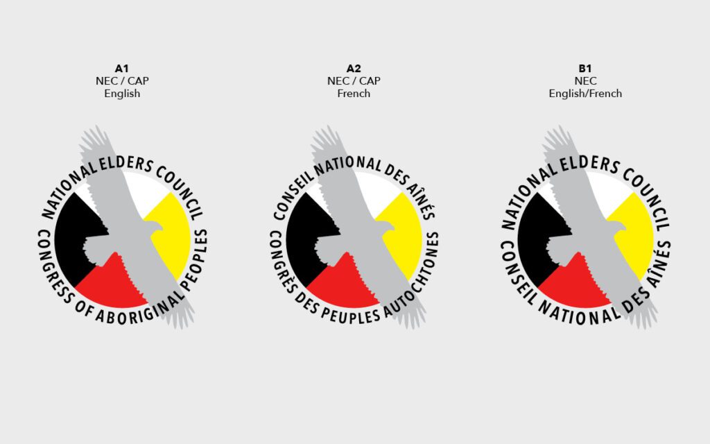
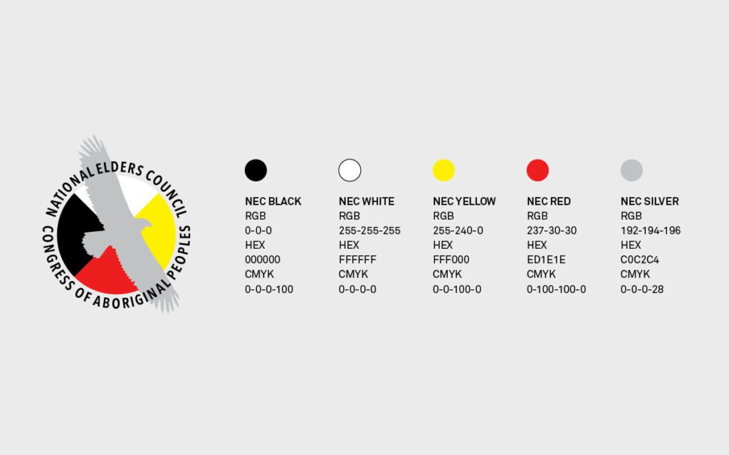
The Congress of Aboriginal Peoples (CAP)’s National Elders Council desired a logo to improve their visibility within CAP and the communities they represent. This increased visibility has led to more opportunities for engagement and knowledge sharing, especially between CAP’s Elders and youth. By engaging directly with CAP Elders, the Creative Fire team had an opportunity to learn the value, meaning and inspiration behind each symbol that was shared. After reviewing our logo options, the CAP Elders determined that their logo should align with the existing CAP logo to clearly show their CAP affiliation when reaching out to their communities. The final logo shows a silver eagle soaring above the four directions.
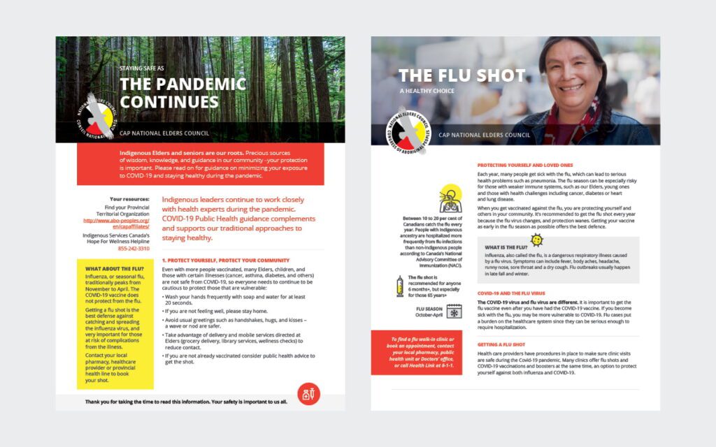
We also had the opportunity to work with CAP on a series of print resources for Elders and seniors related to the ongoing impact of the COVID-19 pandemic on health and safety, as well as the importance of flu shots. We created fact sheets that were informed by traditional and Western approaches to health.


